

I talk ALL the time about buyers markets vs. sellers markets in our Trendline blog posts. Why does it matter?
In a sellers' market, there aren't enough listings available and buyers are fighting for them. Sellers call all the shots. In a buyers' market, there are tons of choices and buyers get to call the shots or walk (to the next listing).
Most of our Silicon Beach communities have been in what I call "Super Seller" markets for as long as I can remember. The sole exception in the beach cities was Venice, but supply has been tightening and even Venice has inched closer to sellers market territory.
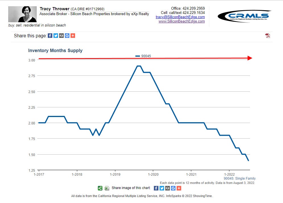
Consider this graph:

This is a graph of available listings for sale in Venice over the last five years. The numbers on the left are "months supply." This means that if no more listings came on the market, it would take x months to sell ("absorb") everything available. That last point on the graph for July, for example, reflects four months supply as of July 31st.
A quick aside about the graph. The data is shown on a 12-month rolling average for the last five years. This means that each dot on the line represents an average of the past 12 months data. I choose that presentation in instances where I want to show more of the historical trend. I could show you a graph with each month's actual number but the volatility of the market makes it harder to tell a coherent story with right this minute numbers, but if you want that graph, text me at 424.229.1634.
If you look at the featured image on this post, it shows the neutral market point being at six months at a national level. Locally, we consider the neutral point closer to three months. At the neutral point, the bargaining positions between the parties are considered "equal." Buyers have choices, but not so many choices that they can easily walk away from an escrow and jump right on another comparable property.
The story being told in the Venice graph is that buyers were firmly in charge since Q3'2019 by national standards and even earlier by our local standards. Buyers still have a very slight advantage in Venice by local standards. This balance of power has been unheard of in most Silicon Beach Communities and likely had more to do with lessened demand due to issues unrelated to housing.
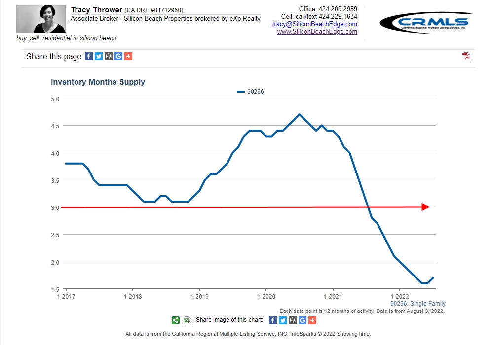
Compare this graph from Westchester:
In Westchester, supply hasn't hit the three month level in any of the last five years! I call this a Super Sellers' Market and scratch my head daily wondering why people don't want to sell in Westchester. Or maybe it's just the crazy high demand. Whichever, listings fly off the shelves in Westchester.
Consider this graph from Manhattan Beach:
The story in Manhattan Beach has been a little more mixed. Since 2018, Manhattan Beach favored buyers until mid-Pandemic when everybody in MB hunkered down. There are not enough listings to satisfy demand and today, Manhattan Beach is in the same Super Sellers market position that Westchester has experienced for the last 5+ years.
Inventory is just one piece of the trendline puzzle. I also track days on market, median price and new listings when I analyze a community. Sold listings is also an important metric to understand.
Hopefully I've demonstrated the importance of understanding the trendline for a community where somebody wants to buy or sell real estate. I write monthly on Venice, Westchester and Manhattan Beach. I'm happy to write custom reports for clients. I can analyze school districts, neighborhoods, zip codes and other definable boundaries. Just ask!